Brand Colours
Colours
Our brand colour palette includes historic colours associated with Durham School and Chorister School, combined with additional support colours that give our brand scheme flexibility and a modern outlook.
Note: CMYK should be used for printing and RGB should be used digitally. If you need advice, contact the Marketing team.
Core brand colours: Durham Blue, Durham Yellow and white are the three core colours used in our logos. The blue and yellow originate from the colours of Durham Cathedral.
Need help choosing colours?
If you are unsure which colour to use, or how to apply tints, contact the Marketing team.
Core brand colours – Durham School


White is a core brand colour and should be used to create clarity, space and contrast.
Support brand colours
As well as the core colours, there are three additional support brand colours you can use.


Support Brand Colour for Chorister School only

Text colours
When typing, black is the default colour to use. As a back-up you can also use white or Durham Grey. Use the best fit for your communication or marketing materials.
House and secondary colours
House colours are used to support House identity where appropriate.
Durham School House colours


Chorister School House colours


How to use our brand colours
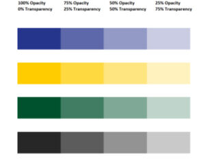 Using tints of the core and support brand colours, and the use of white space, is encouraged to create dynamic and well-structured communications.
These options broaden the colours of our palette and give you more variety when designing materials.