Font/typeface
With accessibility in mind, our fonts help us establish a consistent identity throughout all our communications. The logo font, and all directly published documents use Circular. The other font used (for most users) is Open Sans.
Main font/typeface – Calibri
The font/typeface you and everyone should use is Calibri.
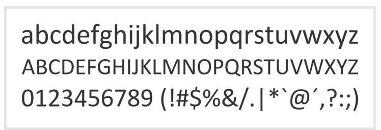
Calibri is a standard Windows Font so you should have it on your computer. If you use a Mac or other non-windows device you may need to download and install it. Instructions on how to download and install Calibri can be found here:
Font minimum size
For screen, the recommended minimum size is 12pt. For print, the recommended minimum size is also 12pt, in exceptional circumstances the absolute minimum font size is 8pt.
Font/typeface principles
- Arrangement of text – written communication is always ranged left. This provides the eye with a constant starting point for each line, making text easier to read. Use sentence case and never set sentences solely in capitals.
- Line spacing – line spacing has a major effect on legibility. It should be carefully considered.
- Letter spacing – when using larger text, attention should be paid to letter spacing.
- Using our typeface – the use of headings, subheadings, and body text can use size, weight, and colour to allow our audiences easier navigation of written content. While not a linear process, some general rules for establishing a clear hierarchy within our visual communications are recommended:
| Format | Calibri |
| Headings | 16pt-18pt Bold |
| Subheadings | 12-14pt Bold |
| Body Text | 12pt |
Marketing font/typeface – marketing & development teams only
LL Circular Medium
LL Circular Medium is our marketing core brand font and is used only by our marketing and development teams in all our official marketing publications and online channels (including our website).
Baskervville
Is our Serif Font – used for publications like the Dunelmian where the readability of close compact text is improved by having serifs. It is a google font.
La Luxes Script/Brittany
Our script font choice is La Luxes Script This is primarily a Canva font but is also available online.
Accessibility
The Disability Discrimination Act 1995 requires us as a service provider to take reasonable steps to ensure all printed material, communications, and marketing activities are accessible to people with disabilities.
Our brand and this toolkit have been prepared considering best practice. Typefaces have been chosen for their legibility, and grids have been provided to ensure an uncluttered design.
Suggestions have been made to help determine sufficient contrast between type and backgrounds, and are also reflected in the guidance on photography. Some documents may need to be made available in plain text formats.